BTS – El Sombrero

As simple as the story line around this photo was, creating the image was no small deal for me.  I would guess that I easily spent 12 hours preparing for and creating this image. While processing I completely started over once, corrected an issue I saw as much as possible and repeated the steps I knew well by then.

Anypose and Lumipro were both used though in the end, the only thing Lumipro was used for was to animate both avatars through the Lumipro sitball. Anypose is proving to be a godsend because in most cases I would never find an pre-made pose that would fill my need and I would have come to this conclusion after many hours of shopping.  Additionally, I have the option of adding any that might have a wider appeal to my marketplace.  (which I do anticipate doing)

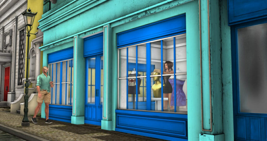
In the beginning.  For “El Sombrero” I required a store to sell the subject hat. I could find nothing suitable in Havana and even traveled to several similarly themed sims but found nothing.  So, I started building a store. It didn’t take long to figure out that I don’t have the building skills to build anything  as realistic as I am demanding. I do now have some not-bad Havana style prim columns…that will probably never be used 😀

With that settled, I returned to Havana and found this building that I felt I could make in to my store if I could rez. Joining the Havana group in world for L250 gave me rez rights. With so many ideas for pics on this vacation, I could have made the previous images easier had I joined the group earlier.

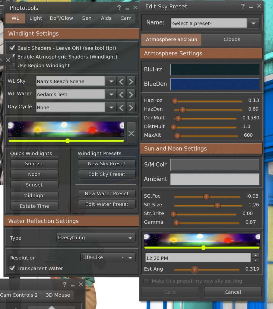
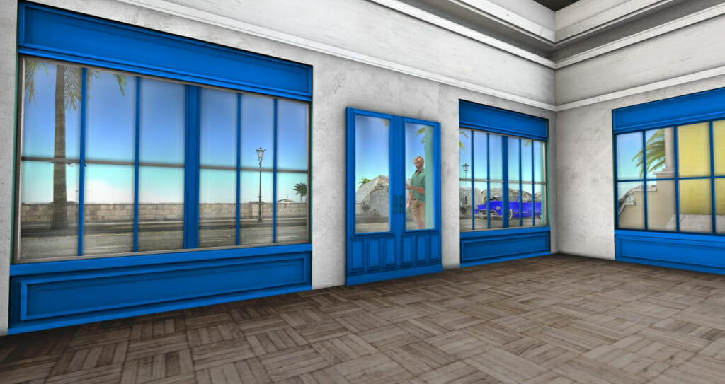
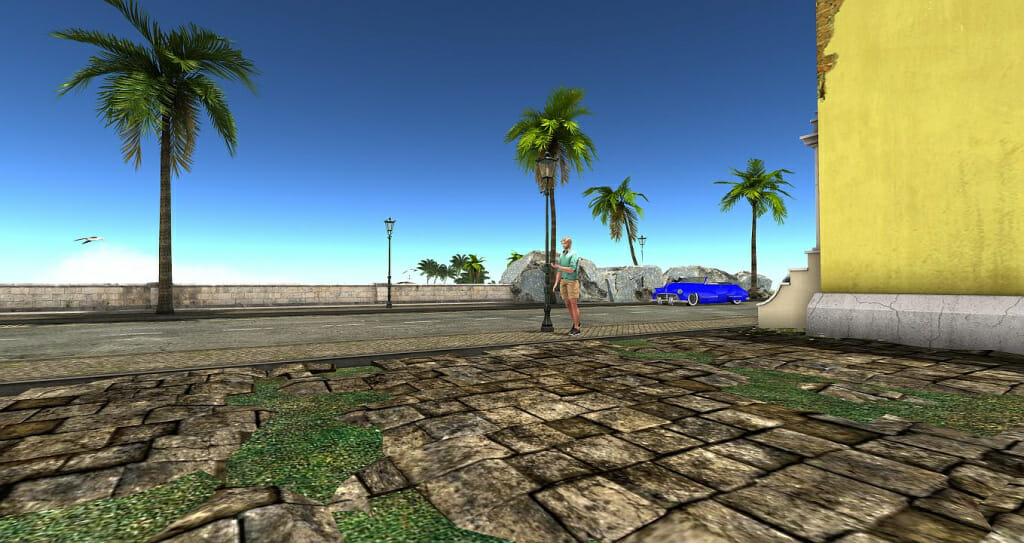
The initial image was photographed with my video settings set to Ultra and the windlight setting as indicated – Nam’s Beach Scene is the initial preset. The only adjustments made was in the time of day and angle.  I was looking for something shortly after noon so the sun is nearly straight overhead.

Original Capture - El Sombrero
Windlight settings - El Sombrero

Havana is a very colorful build.  In most of my pics so far, I’ve felt it necessary to tone down the colors. This would be no different.  Additionally, to make the image more realistic, I needed different lights inside and something to fill the bare walls.  It because quickly obvious that I would need four layers to work with

  1. Aedan
  2. Store Front
  3. Display (w/Christi)
  4. Inside Walls
Attempt to create a mask in world

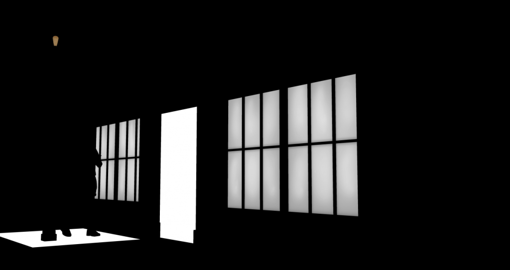
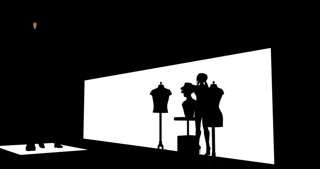
Using the trick I learned from Natsumi, I rezzed a prim inside the building, pulled it up close to the windows to block out Christi and the display that was already in place. I realized at the time that by pulling it so close to the wall, I lost the windows in the doors.

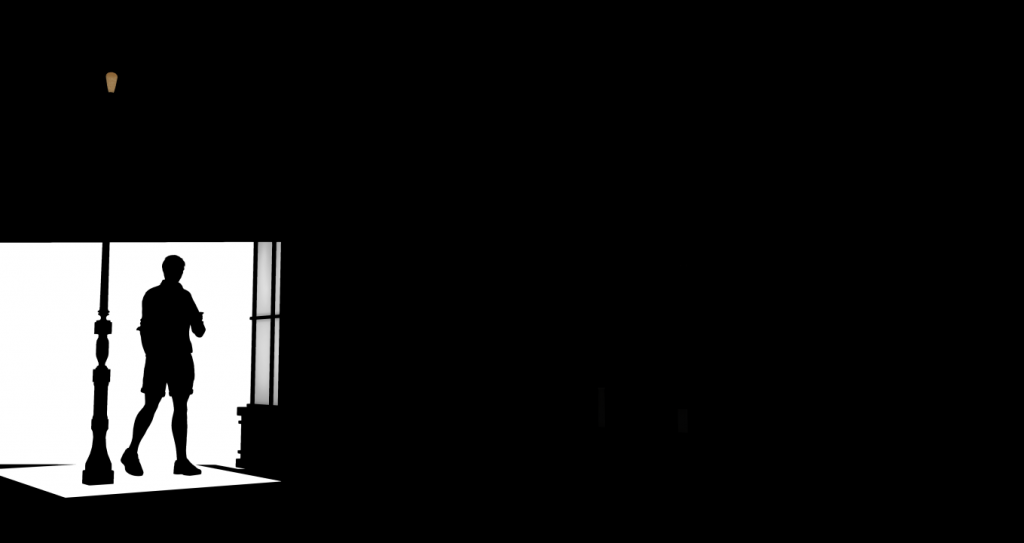
This wasn’t the only thing wrong with this mask – I failed to notice that the prim wasn’t tall enough to reach to the top of the windows. Though I went back in world for a second chance I wasn’t able to get the camera, viewing angle and Aedan all positioned in the exact same spots again. In the end, I had to piece together several pieces to create a functional mask.

Display Mask - El Sombrero
Aedan's Mask - El Sombrero

And so the journey continued…level adjustments, saturation tweaking, fixing missing shadows and wardrobe issues.  When the inside walls were darkened several issues came to light around the masking. Basically, I had to start over and redo some things to get back to the same point.

When I ‘thought’ I was finally done, it became apparent that all of the masking made the glass in the windows hardly visible….and on such a bright day, wouldn’t there be reflections?  I had an idea in my mind about what would be in the reflections but once I got back in world and moved inside the building, it became obvious that Aedan’s reflection would not be in the window beside him.  In hind sight, it probably wouldn’t be where it ended up at either because the column between him and the door would keep that from happening.


View from the pugh - El Sombrero
Reflections - El Sombrero

In the end…I’m basically happy with this image. The windows are too clean – that is bugging me a bit but not enough to change the image since it has been posted to flickr.

Like everyone of these, I feel I’ve learned a lot that will make future edits move more smoothly.  Above all else though, this was fun.  Can’t ask for much more than that.  Now, on with the next adventure!
No Surprise Here

Loading the car for a trip
Trying to leave again
Facebook
Twitter
Tumblr
Email

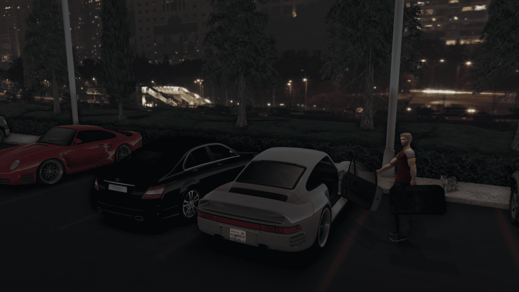
Of course vacation plans in SL are subject to complications just as in RL  You think you have everything packed and just as you’re about to get into the car you panic that you forgot something. Is it in the suitcase or..or is it lost? Similarly, I had spent hours setting up for this shot, tweaking the light, setting the pose – and that was after chasing down suitcases, cars, cats and parking lot textures! We won’t even talk about the cars I got at a very good price – too good to be true even with broken scripts. (Yes, I am lodging a complaint because at least one had a negative review because of the same issues I had).  After all that and then taking the picture, editing in Gimp because the only opening suitcase I could find that was half modern or not beat up was pink…after all that, you realize the jacket you’re wearing is a mess!

In all fairness, it was a few years old and the creators have a tough time dealing with the varied size avatars..but my avatar is 6 and a half feet tall and muscled…and small is too big!  So, refusing to leave home like that I had to go shopping.  I hate shopping for men’s clothes for this very reason.  Time lost shopping only to pull something else out of the drawer and set everything up for the photo again.

Unable to get the exact same lighting, I then spent another hour trying to (and took screen shots of the settings this time!) get the same angle, same light ( and failed) before saying ‘enough!’.  I’m getting really good at changing the color of items in Gimp by now so that was easy.

Almost ready to upload and then I noticed the cat was missing half it’s head! Really!? Log back in, set everything up as close as I can and…get a good picture of the cat from the same angle and distance…and hopefully with light close enough that it’s easy to bring into the image.  One last check and I realized that on one of my monitors it was too dark so I lightened the image before uploading.

There! Now we’re ready to go.  Get into the car! No, not you kitty…

Yes, it wasn’t too long before I was told the image was too dark.  I’m just ready to hit the road by now though I am a bit concerned that I’ve missed my flight…

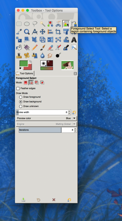
Gimp Foreground Select

Rottendam - Too Bright
The starting point ..

From my post yesterday, you might recall that I was on a trip to find some objects for a secret and huge project I’m working on when I stumbled across this guy passed out on the street. It seemed like an opportunity to get some practice with my LUMIPro but I ended up taking the image into Gimp because I still couldn’t get exactly what I wanted.  I’ve found myself frequently needing to extract the subjects of photos from their backgrounds and this seemed to be one of those times.

Because this is becoming a frequent practice, I figured I should make myself more proficient at what I understand is supposed to be the latest and easiest way to isolate items in Gimp. The Foreground Select tool.  Here I go down another path!

To date, my experience with this tool has been only marginally better than using either the “free” or “fuzzy” select tools to do the same thing.  When it’s all said and done, I am still finding myself going back and spending perhaps hours removing unwanted pixels with the wrong color.  Unfortunately, this attempt has been no better.

However, I did learn one thing that prompted me to create this post.  When my attempts to identify the foreground and background using the tools presented by Foreground Select left so much wanting, I figured there must be something else to try. I watched a few tutorials on youtube and all showed the same thing though one was amazingly successful and extracting blowing hair from it’s background (video below).

In that video, the presenter is using the ‘Matting Levin” engine. On my machine, it was set to use the other engine, Matting Global, and I was unable to change the selection.  Similarly, the machine I am currently on is defaulted to the Matting Global but is denying the option to change engines.

I searched and read quite a bit but found nothing explaining why I had no other option.  I suspected it might be hardware.

Gimp Foreground Select Tool

I only recently built the machine that I’m using to take photos in SL.  It has what is supposed to be an exceptional video card which I may review later. Early on, I determined to use that machine ONLY for ‘gaming’ and web browsing when it was convenient.  No other software would be installed on that machine.  However, early on, I had installed Gimp before I reached that decision so I fired it up and sure enough, on that machine, I do have the ability to select either engine.  Just for fun, I tried extracting the same image from the photo above and though the result was slightly better, it still fails in comparison to the video below.  So, my search continues.  As is the story of my life, yet another small project has taken a life of it’s own.

We are using cookies on our website

Cookies are used to help improve the usefulness and attraction of this site. Please confirm, if you accept our tracking cookies. You can also decline the tracking, so you can continue to visit our website without any data sent to third party services. Thank you.